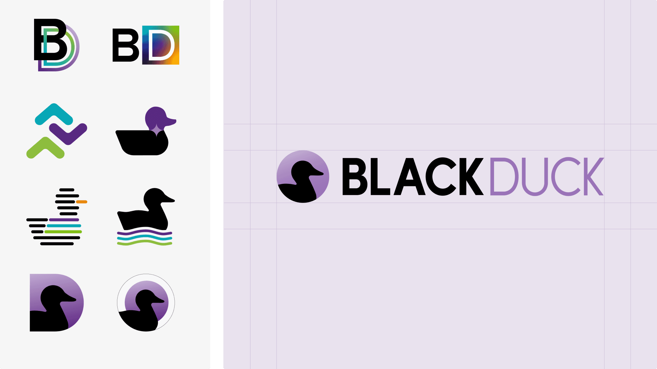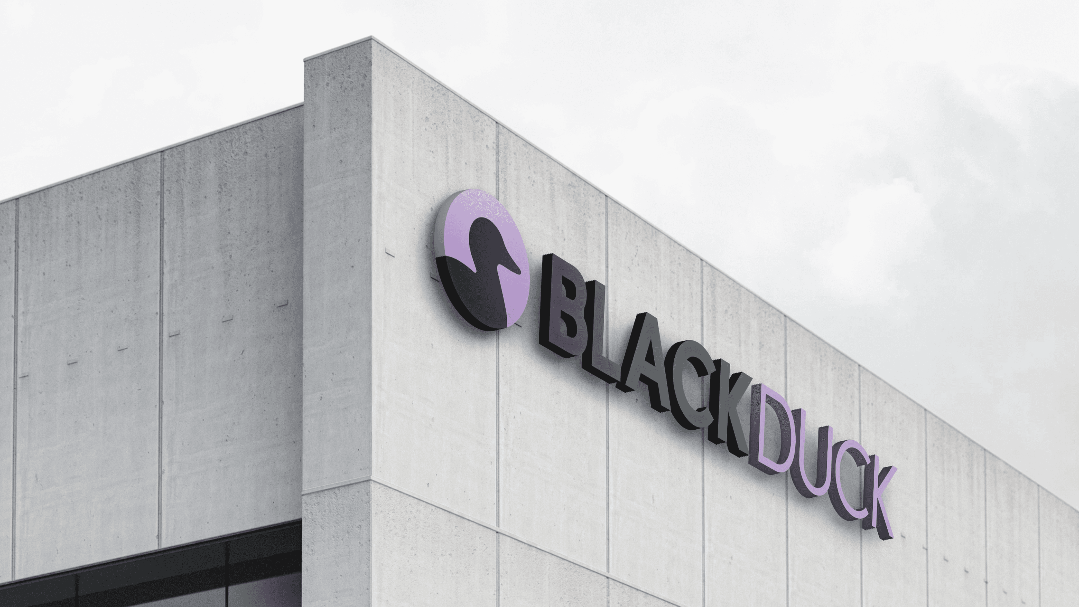
The Black Duck rebrand was a high-pressure carveout initiative tied directly to the company's separation from Synopsys. The work had to be developed and launched on an aggressive timeline, in close collaboration with C-suite leadership and a broad group of stakeholders, including significant oversight from the backing equity firms. The core tension was balancing speed, alignment, and execution while preserving the brand recognition and trust built under Synopsys, all while positioning Black Duck as a credible, independent security company with its own identity and future vision.
I led the evolution of the visual identity system with a focus on scalable, cohesive brand architecture that could unify marketing, product, and sales experiences under a single modernized identity. The system needed to feel familiar enough to preserve trust while introducing enough refinement to signal a new chapter. Collaboration was central: frequent executive reviews and rapid iteration cycles kept multiple stakeholders aligned without losing momentum against the compressed timeline.
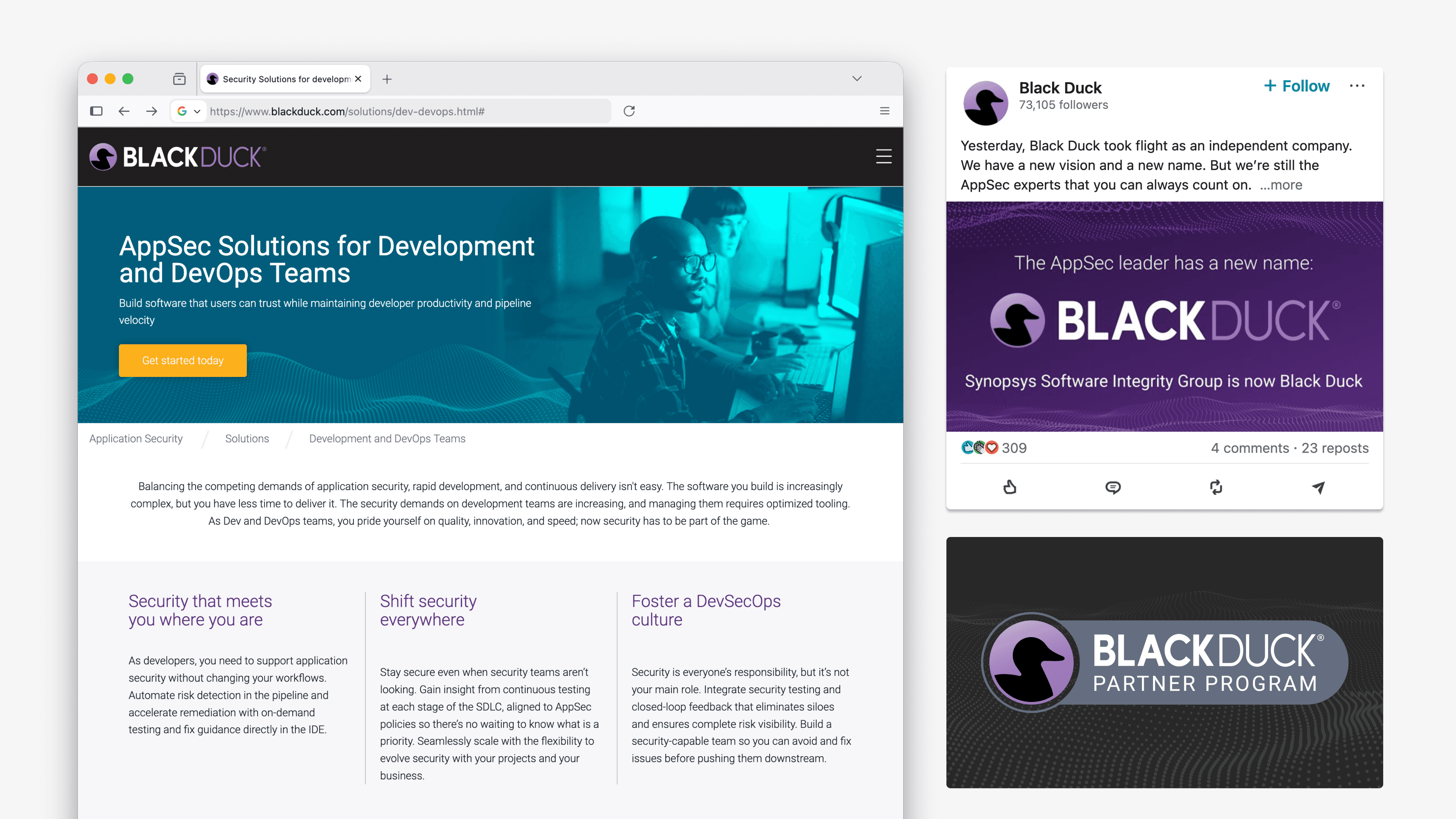
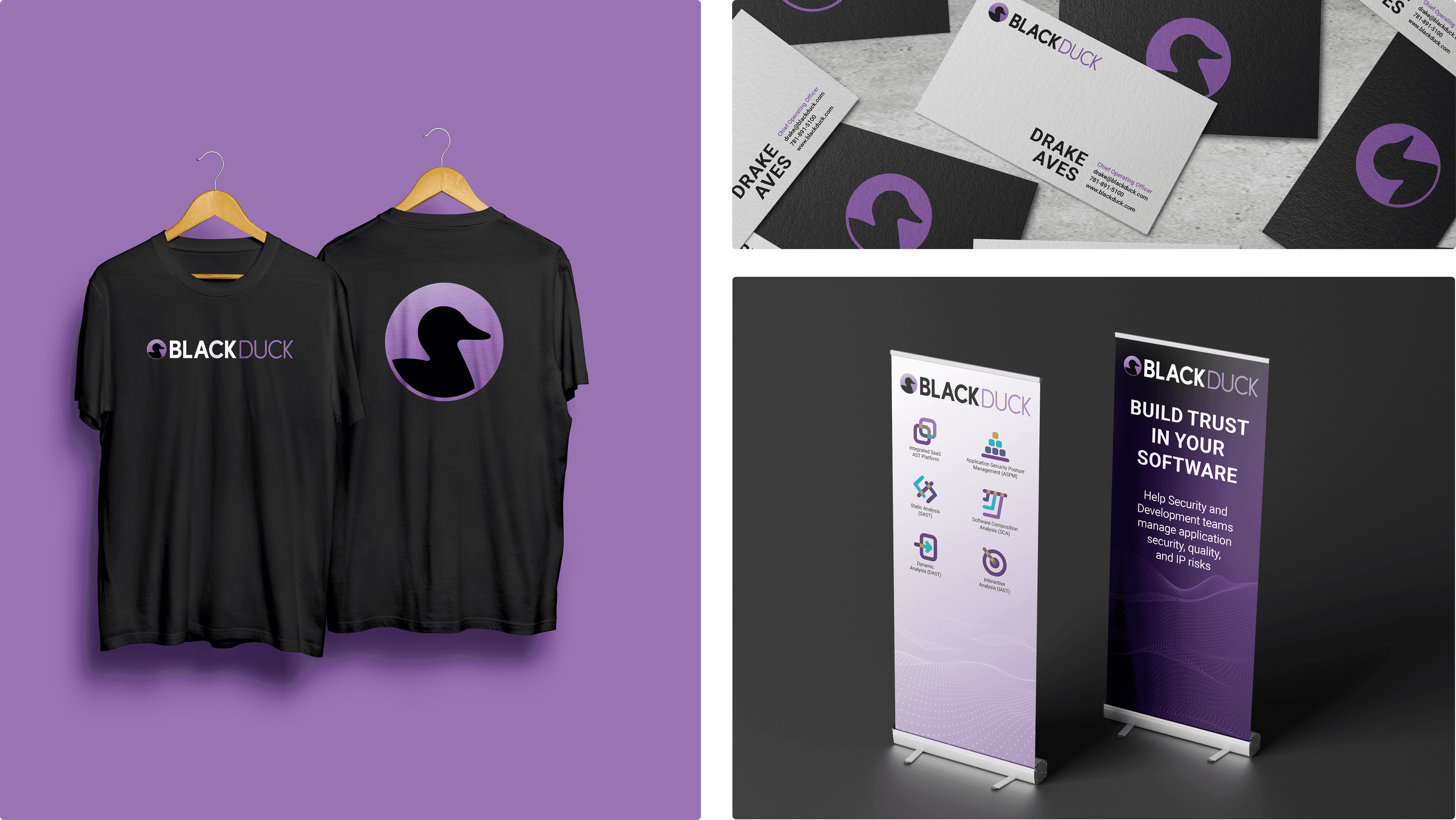
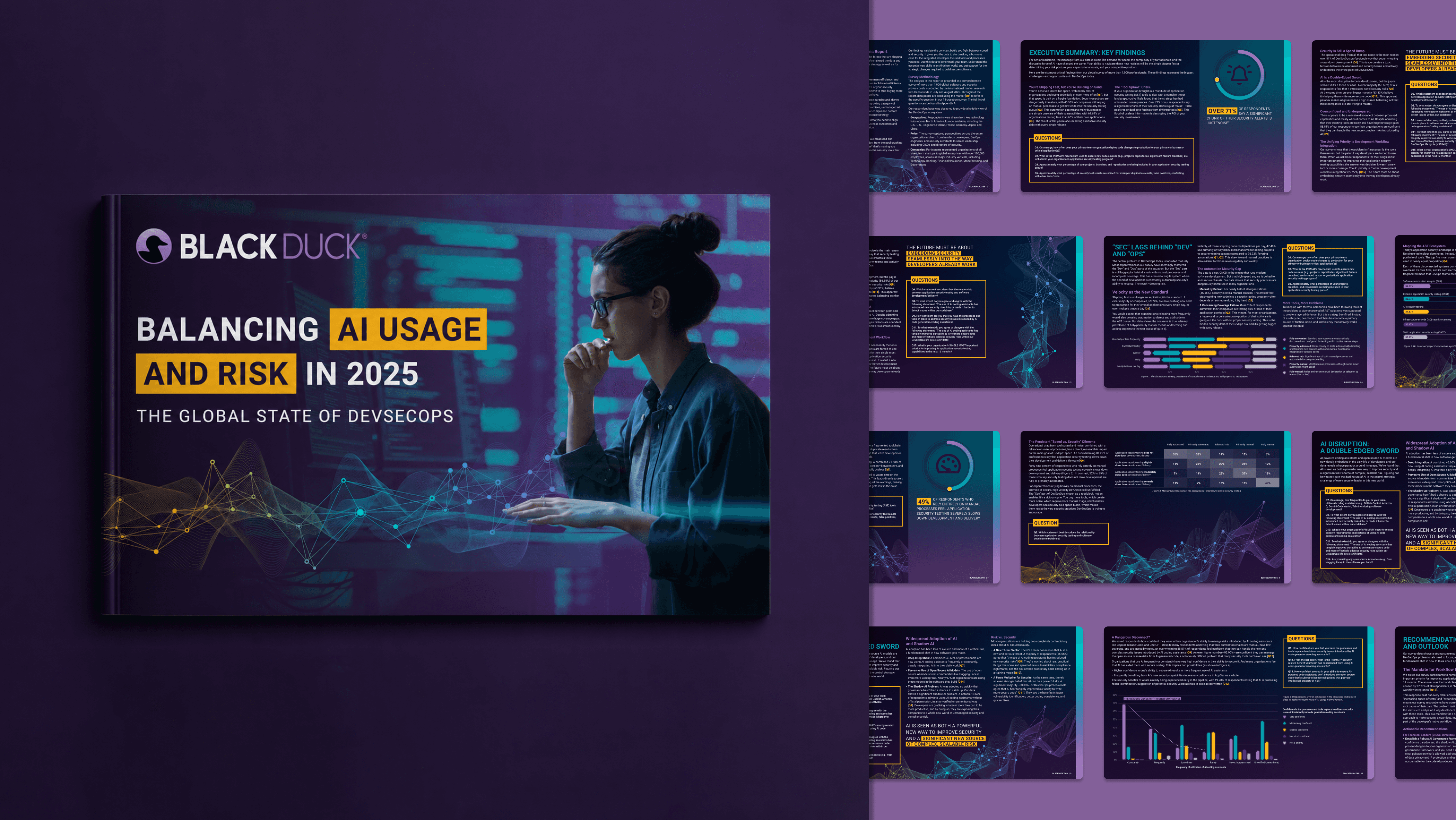
The rebrand launched successfully alongside Black Duck's emergence as an independent company, establishing a distinct market presence while maintaining continuity with its reputation in the AppSec space. The new system meaningfully improved internal enablement across sales, marketing, and executive communications, creating a more consistent and scalable experience across the organization. Leadership recognized the work as a foundational platform for future brand evolution, a flexible system built to grow alongside the company.